
About Sizzy
Overview
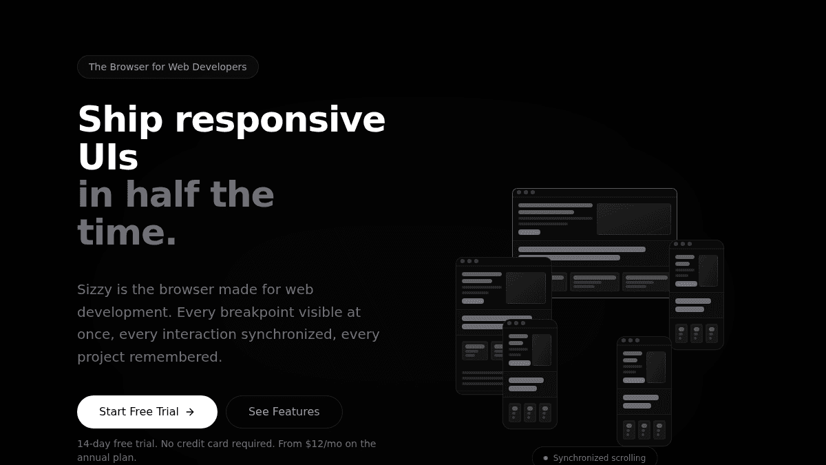
Sizzy is a browser workspace built specifically for web developers to test responsive designs across multiple devices in a single window. Instead of opening five separate browser windows to test different screen sizes, developers open Sizzy and see iPhone, iPad, desktop, and other devices side-by-side with synchronized scrolling, clicking, and form inputs.
The product solves the friction of testing responsive designs on real device dimensions without repeatedly opening new windows or logging in and out of user accounts. Web developers, frontend engineers, and QA teams use Sizzy to verify layouts, test user flows, and debug CSS across breakpoints in a fraction of the traditional time.
Key Benefits
- Test all device breakpoints simultaneously with synchronized scrolling, clicking, and form inputs across every screen.
- View real device dimensions with accurate pixel ratios, user agents, device frames, and OS UI to see exactly what users see.
- Debug CSS and responsive layouts using unified DevTools that monitor all devices from a single console panel.
- Test multiple user accounts and permission roles at the same time on different devices without repeated login.
- Create pixel-perfect mockups and screenshots with movable device frames and custom backgrounds for presentations.
- Save project-specific configurations including bookmarks, notes, presets, and layout preferences for instant context switching.
How It Works
Open Sizzy and add the devices you want to test—iPhone, iPad, desktop, and more appear side-by-side on your screen. Click a button on one device and every device triggers the same interaction in real-time. Scroll on one screen and all synchronized devices scroll to the same position, allowing you to compare layouts instantly. Use the unified DevTools panel to inspect elements, monitor network requests, and debug CSS across all devices from one place.
Use Cases
- Frontend engineers testing responsive breakpoints across five or more device sizes simultaneously without opening separate windows.
- Web developers debugging CSS issues on real device dimensions and seeing exactly how users experience mobile layouts.
- QA engineers verifying permission-based features by logging in as different user roles on different devices at the same time.
- Product teams creating pixel-perfect mockups and demo screenshots with realistic device frames for marketing and documentation.
- Design systems teams testing component behavior across multiple screen sizes and color themes simultaneously.
Why Choose This Product
Sizzy is best for web developers and frontend engineers who spend significant time testing responsive designs and need to verify layouts across five or more device sizes. The product eliminates the friction of opening multiple windows, repeated login cycles, and switching between DevTools instances. Over 10,000 developers use Sizzy, and the product has shipped 738 releases since 2018, demonstrating active maintenance and continuous feature additions.
Sizzy Pros & Cons
- Tests multiple device sizes simultaneously with synchronized interactions across all screens
- Includes 100+ features specifically designed for web development workflows
- Actively maintained with 738 releases since 2018 and #1 Product Hunt ranking
- Unified DevTools panel debugs CSS and monitors all devices from a single place
- Permission testing allows logging in as different user roles on different devices at once
Key Features
Synchronized Interactions
Scrolling, clicking, and form inputs sync across all devices in real-time to test user flows without repetitive actions.
Real Device Dimensions
Test on accurate device sizes including iPhone 15 Pro, iPad Pro, MacBook Pro, and others with correct pixel ratios and user agents.
Photo Studio Mode
Move and resize devices on a canvas, add custom backgrounds and gradients, and export pixel-perfect mockups as PNG, JPG, or video.
Universal DevTools
Single DevTools panel controls debugging for all devices with unified console, style inspector, API monitor, and network simulation.
Session Manager
Log in with different user accounts on different devices simultaneously to test permission roles and access levels.
Project Workspaces
Save per-project configurations including bookmarks, notes, presets, and snippets to switch contexts instantly.
Internationalization Testing
Quick switch devices to any locale to test internationalization features without leaving the application.
Butler Commands
Power-user command system to convert colors, encode strings, search npm and caniuse without context switching.
Recording and History
Capture screenshots and GIFs of interactions, save every session with timestamps, and re-test past interactions.
Sizzy Pricing
View full pricing →- 14-day free trial access to all features
- No credit card required
- Synchronized scrolling, clicking, and forms across devices
- Real device dimensions and accurate pixel ratios
- Universal DevTools for debugging across all devices
- Photo Studio mode for creating mockups
- Session Manager for multiple user accounts
- 100+ features for web development workflows
| Feature | Free Trial Free/mo | Annual Plan $12/mo |
|---|---|---|
| 14-day free trial access to all features | ||
| No credit card required | ||
| Synchronized scrolling, clicking, and forms across devices | ||
| Real device dimensions and accurate pixel ratios | ||
| Universal DevTools for debugging across all devices | ||
| Photo Studio mode for creating mockups | ||
| Session Manager for multiple user accounts | ||
| 100+ features for web development workflows |
Pricing extracted from the product website and may change. Check the source for current details.
Frequently asked questions about Sizzy
Is Sizzy free?
Sizzy offers a free plan with optional paid upgrades. See the pricing section for what's included in each tier.
How much does Sizzy cost?
Sizzy offers the following plans: Free Trial, Annual Plan. See the pricing section for what's included in each tier and any per-seat or usage-based costs.
What platforms does Sizzy support?
Sizzy is available on: Web.