About Butterick's Practical Typography
Overview
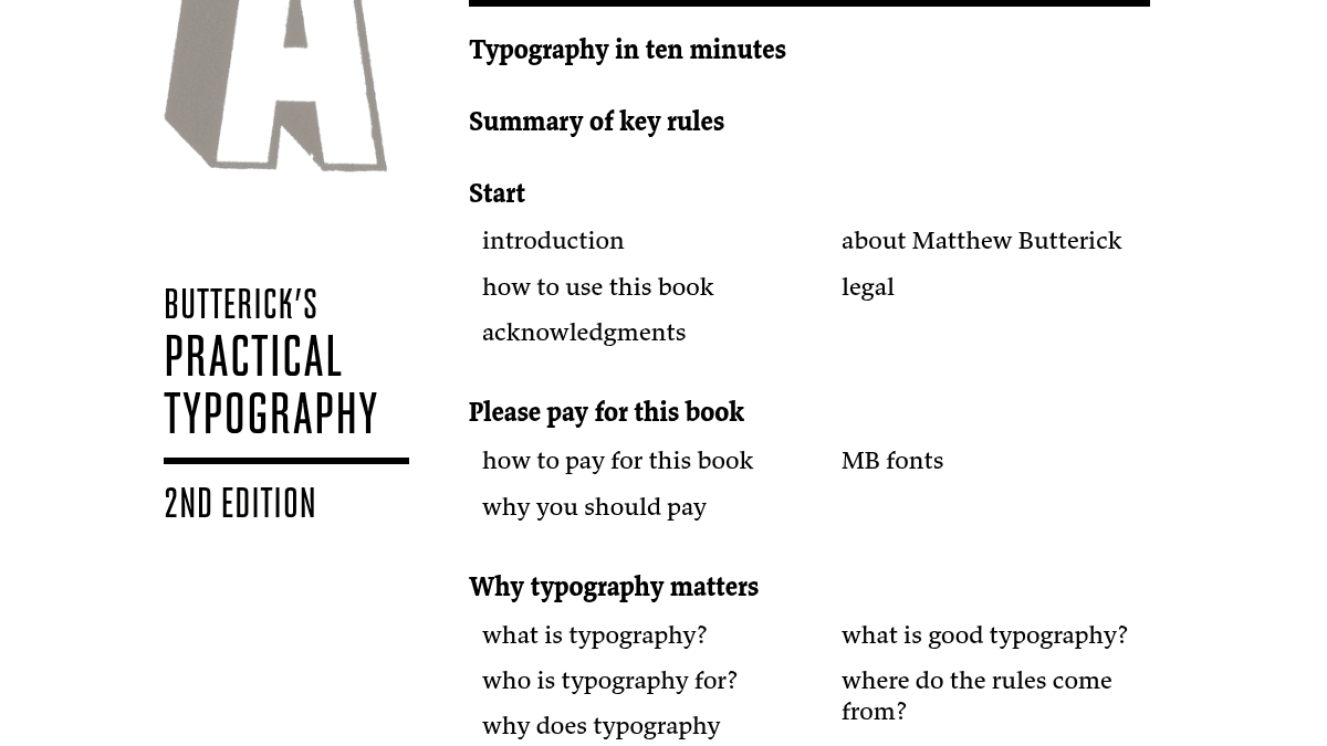
Butterick's Practical Typography is a web-based book that teaches typographic principles for anyone who works with words on a screen or page. It covers the full spectrum of typographic decisions that arise in everyday documents, websites, presentations, and correspondence.
The book shows readers how to identify and correct common typographic mistakes — from straight quotation marks and double spaces to bad font choices and poor page layout. It is written for non-designers who produce their own documents and want better results without hiring a professional.
Key Benefits
- Readers can learn the essential rules of good typography in about ten minutes using the dedicated summary chapter.
- The book provides specific font recommendations with named alternatives for every major system font category — Helvetica, Times New Roman, Courier, Calibri, and more.
- Each topic is presented as a short, self-contained section so readers can look up exactly what they need without reading the entire book.
- The book has been reader-supported and ad-free since 2013, with no ads, trackers, or third-party content.
- Matthew Butterick is also a practicing lawyer and programmer, bringing a multidisciplinary perspective that bridges type design with law and software.
How It Works
Readers open the book in any web browser and navigate by chapter using the left-side menu or the in-chapter forward/back controls. Each section explains one typographic concept — such as straight versus curly quotes, proper use of hyphens and dashes, or correct line spacing — with before-and-after examples and a clear rule to follow. Font recommendations link to the author's own typeface family pages where available, and the appendix sections provide step-by-step instructions for tasks like embedding fonts in Word documents or making PDFs.
Use Cases
- Lawyers who need to produce clean, professional court filings and correspondence — the author also wrote Typography for Lawyers as a paperback companion.
- Students writing research papers and theses who want to avoid formatting errors that undermine their credibility.
- Office workers creating business letters, memos, and reports who have never been taught basic typographic conventions.
- Self-employed professionals designing their own letterhead, business cards, and résumés without a graphic designer.
- Web developers and writers building content online who want to understand how type behaves on screens versus paper.
- Anyone who has inherited bad typographic habits from the typewriter era — using two spaces after a period, underlining instead of italics, or monospaced fonts for body text.
Why Choose This Product
This book is best suited for writers, lawyers, students, and professionals who produce their own documents and want a single authoritative reference for typographic rules. It does not cover graphic design or layout software training, and it is only available as a free website — there is no e-book or PDF version, which the author explains in detail is a deliberate economic choice to keep the book ad-free and accessible.
Butterick's Practical Typography Pros & Cons
- Comprehensive free reference on practical typography
- Ad-free and reader-supported since 2013
- Written by a lawyer-typographer with multidisciplinary expertise
- Includes specific font recommendations with alternatives
- Covers both print and screen typography in one place
Key Features
Ten-minute summary
Each typographic rule is presented in short, self-contained sections with a combined summary chapter called "Typography in ten minutes."
Font recommendations
The book devotes a full chapter to font recommendations including system-font alternatives, free fonts, and the author's own typeface families.
Sample documents
A dedicated chapter shows how to set up letterhead, business cards, résumés, research papers, and presentations with correct typography.
Practical appendix
The appendix walks through tasks like embedding fonts in Word, making PDFs, identifying fonts, and working with a professional designer.
Type composition
Topics include straight versus curly quotes, hyphen and dash usage, ellipses, apostrophes, accented characters, ligatures, and math symbols.
Layout rules
The page-layout chapter covers centered text, justified text, first-line indents, line spacing, line length, margins, hyphenation, and widow/orphan control.
Commentary essays
Matthew Butterick writes with a personal, opinionated voice and includes essays on the economics of web publishing, variable fonts, and typography in pop culture.
Butterick's Practical Typography Pricing
Pricing extracted from the product website and may change. Check the source for current details.