
About Utopia
Overview
Utopia is a systematic approach to fluid responsive design that scales type and space proportionally across viewports without relying on arbitrary breakpoints. Rather than designing for multiple fixed screen sizes, Utopia lets designers define scales for small and large screens, then allows the browser to interpolate between them based on viewport width.
Utopia is not a product, plugin, or framework to install. Instead, it is a methodology for thinking about responsive design that emphasizes collaboration between designers and developers through shared, systematic design foundations.
Key Benefits
- Design and code with minimal, elegant solutions instead of managing multiple breakpoints.
- Improve collaboration between design and development teams by sharing a unified approach to scaling.
- Maintain visual harmony and consistency across all viewport sizes through proportional scaling.
- Reduce decision fatigue by establishing type and space systems upfront rather than handling each breakpoint separately.
How It Works
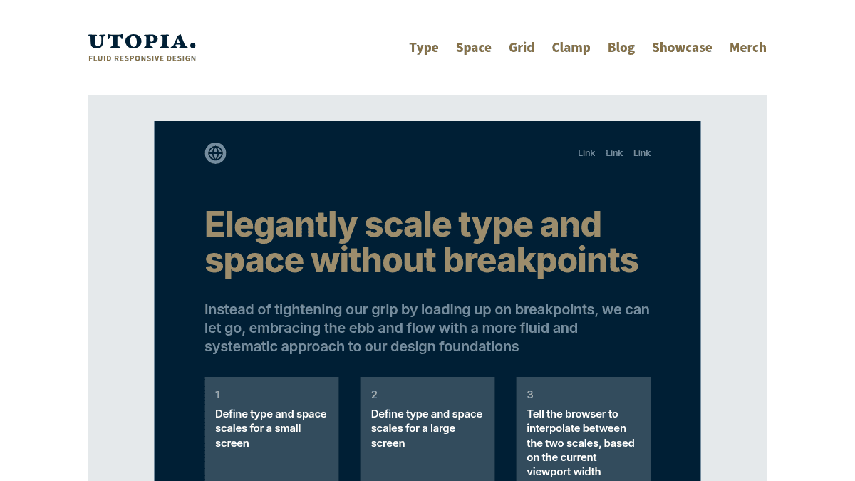
Define your type and space scales for a small screen and a large screen, specifying minimum and maximum values. Tell the browser to interpolate between these two scales based on the current viewport width using CSS calculations. The system then scales your design fluidly across all intermediate viewports.
Use Cases
- Product designers building design systems need to establish fluid scaling rules that developers can implement consistently without breakpoint-specific overrides.
- Front-end developers creating responsive layouts can use fluid type and space calculations to reduce media query bloat.
- Design and development teams collaborating on shared projects benefit from a common language and methodology for responsive behavior.
- Individual freelance designers and developers working solo can simplify their responsive design workflow with minimal tooling.
Tools and Resources
- Type calculator: Generate fluid type scales between defined minimum and maximum sizes.
- Space calculator: Calculate fluid spacing values across viewports.
- Grid calculator: Support for fluid grid layouts.
- Educational articles and videos explaining the philosophy and implementation of fluid responsive design from both designer and developer perspectives.
Utopia Pros & Cons
- Free tools including type, space, and grid calculators
- No installation required—pure methodology based on CSS
- Extensive educational content from designer and developer perspectives
- Reduces breakpoint management and code complexity
- Improves cross-team collaboration between designers and developers
Key Features
Type Calculator
Generates fluid type scales that interpolate between minimum and maximum font sizes across viewports.
Space Calculator
Calculates fluid spacing values that scale proportionally based on viewport width.
Grid Calculator
Provides support for creating fluid grid layouts without fixed breakpoints.
Fluid Interpolation
Browser automatically scales design elements between defined small and large screen scales.
Breakpoint-Free Design
Eliminates the need for multiple media queries by using continuous scaling instead of discrete breakpoints.
Educational Resources
Includes video tutorials, articles, and guides explaining fluid responsive design from designer and developer perspectives.
Utopia Pricing
Pricing extracted from the product website and may change. Check the source for current details.
Frequently asked questions about Utopia
Is Utopia a product, plugin, or framework?
Utopia is neither a product, plugin, nor framework. It is a methodology or way of thinking about fluid responsive design. While there is no program or dependency to install, free tools are available to support Utopian projects, including type, space, and grid calculators.
What free tools does Utopia provide?
Utopia provides three free calculators: a type calculator for generating fluid type scales, a space calculator for fluid spacing values, and a grid calculator for fluid grid layouts. These tools support implementing the Utopian methodology without installing external dependencies.
How does fluid responsive design work in Utopia?
You define type and space scales for small and large screens with specific min and max values. The browser then interpolates between these scales based on viewport width, creating continuous scaling across all screen sizes instead of using discrete breakpoints.
Is Utopia free?
Yes — Utopia is free to use. See the pricing section for any optional add-ons.
What platforms does Utopia support?
Utopia is available on: Web.